
Choosing a color palette that feels like you is all about expressing who you are and creating the right mood. Start by considering calming neutrals for a serene atmosphere or bold hues for a lively touch. Earthy tones can connect your space with nature, whereas monochromatic schemes add depth and tranquility. Accent colors, like lively pillows or artwork, can improve your overall design. Think about seasonal inspirations too, allowing your home to evolve with the changing months. Exploring your unique palette can truly reflect your personality and lifestyle. There's so much more to discover about personalizing your space!
Understanding Color Psychology
Color psychology plays a crucial role in how we perceive and interact with our surroundings, and it's important to grasp its impact when choosing a palette for your home. Every color evokes specific emotions and carries unique meanings, making your choices deeply personal. When you think about color associations, consider how a lively red might ignite passion, whereas calming blue can promote tranquility. These color influences not only affect your mood but likewise shape the ambiance of your space.
Exploring color symbolism can help you connect with your environment on a more profound level. For instance, green often symbolizes growth and renewal, making it a popular choice for spaces that inspire creativity. Your personal preferences and past experiences, or color memories, will guide you in selecting hues that resonate with you.
As you navigate through current color trends, bear in mind that they're often rooted in cultural influences and collective feelings. Aim for color harmony by balancing bold shades with softer tones, creating an inviting atmosphere. Think of how different colors interact, both physically and emotionally.
Ultimately, your home should reflect who you are. By comprehending the meanings behind colors and how they can shape your daily life, you'll create a space that feels authentic and nurturing. Embrace this path, and let your palette tell your story.
Calming Neutrals for Serenity
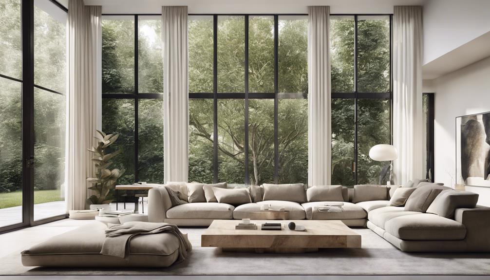
When creating a serene home environment, calming neutrals can be your best friends. These gentle shades invite tranquility and make your spaces feel more inviting. By incorporating soft textures and minimalistic designs, you can craft serene spaces that promote relaxation and peace. Think of a cozy room adorned with layered neutrals, where light reflections dance off the walls, creating a soothing ambiance.
To improve this serene vibe, consider adding calming patterns that echo nature influences. Envision a plush rug with subtle leaf motifs or curtains in delicate, organic shapes. These elements will not only uplift your decor but likewise bring a sense of harmony and comfort.
Here's a quick guide to help you choose the right calming neutrals for your home:
| Color | Best Used In | Tranquil Accents |
|---|---|---|
| Soft Beige | Living Rooms | Earthy Pots, Natural Fabrics |
| Cool Gray | Bedrooms | Soft Throws, Minimalist Art |
| Pale Taupe | Dining Areas | Warm Lighting, Wooden Accents |
| Light Ivory | Bathrooms | Simple Accessories, Greenery |
Bold and Vibrant Hues
If you're looking to energize your home, bold and lively hues can really shake things up. These radiant colors transform spaces into energetic environments that reflect your adventurous spirit. By incorporating color blocking techniques, you can create striking contrasts that draw the eye and invigorate the atmosphere. Envision pairing a deep teal with a sunny yellow—this playful combination can become the heart of your room.
Statement furniture in bright colors can serve as conversation starters, as bold textiles add depth and warmth to your space. Think plush cushions in eclectic patterns or a lively area rug that invites you to kick off your shoes and relax. Don't shy away from bold artwork; expressive murals or colorful canvases can become the focal point, making your walls pop with personality.
To amplify the lively vibe, consider integrating playful accents like colorful vases or whimsical sculptures. Dramatic lighting can equally set the mood, casting shadows that dance across the walls and highlight your chosen hues. The key is to maintain balance—mixing adventurous combinations of colors and textures allows for a dynamic yet cohesive look.
Ultimately, your home should tell your story. By embracing bold and lively hues, you create energetic spaces that resonate with joy and creativity. So go ahead, release your inner designer and let your personality shine through every colorful detail. Your home deserves to feel as lively and expressive as you are.
Earthy Tones for Connection
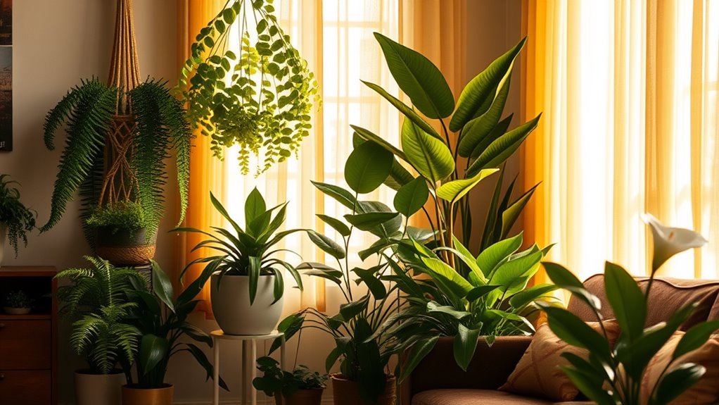
Five earthy tones can ground your home and cultivate a sense of connection with nature. Picture wrapping yourself in the warm embrace of terracotta, olive green, sandy beige, deep brown, and rich rust. These colors bring the essence of the outdoors inside, creating a peaceful retreat that feels intimate and inviting.
By incorporating earthy textures and natural materials, you can improve this connection. Think about using reclaimed wood for your furniture or adding woven baskets to your decor. These elements add depth and warmth, making your space feel more alive. When you choose fabrics like linen or wool in these earthy tones, they not merely look good but also create a comforting atmosphere that encourages relaxation.
You can likewise play with layering these colors throughout your home. Start with a warm beige on your walls, then introduce olive green through your cushions or curtains. A touch of rust in your artwork or decorative pieces can tie everything together beautifully.
Monochromatic Schemes Simplified
Earthy tones create a warm and inviting atmosphere, but sometimes simplicity can bring a striking elegance to your space. Embracing a monochromatic scheme allows you to explore the depth and beauty of a single color, making your home feel cohesive and serene. One of the key monochromatic benefits is how it visually expands your space, creating a sense of calm and unity that's hard to resist.
When you choose a monochromatic palette, you're not restricted to just one shade. Consider varying the intensity and tone of your chosen color. This approach invites you to play with layering textures, which adds richness and interest to your decor. Picture soft, plush pillows in a muted hue paired with a sleek velvet sofa of a deeper shade. The interplay between these textures creates a warm embrace, inviting you and your loved ones to linger a little longer.
To improve this scheme, incorporate various materials—think wood, metal, or ceramics—each in shades that complement your chosen color. This layering not only breaks the monotony but moreover enriches the visual experience. You'll find that a well-executed monochromatic design can evoke feelings of intimacy and comfort, making your home a true reflection of who you are.
Pastels for a Soft Touch
Pastel colors can transform a room into a serene oasis, evoking a sense of calm and tranquility. By incorporating pastel palettes into your home, you create an inviting atmosphere filled with soft accents and gentle tones. Envision walking into a space adorned with muted shades, where the airy vibes wrap around you like a warm hug.
To help you choose the perfect pastel hues, here's a simple guide:
| Color | Description |
|---|---|
| Soft Pink | Adds warmth and nurturing vibes |
| Light Blue | Evokes serenity and peace |
| Mint Green | Revitalizing and uplifting |
| Lavender | Calming and soothing |
| Peach | Playful, yet gentle |
These playful pastels work beautifully together, allowing for subtle contrasts that create a harmonious balance. Picture a living room with soft pink cushions against a light blue wall, or perhaps a calming lavender bedroom with mint green accents. Each choice contributes to a serene aesthetic that invites relaxation and connection.
When you embrace pastel shades, you're not just decorating; you're crafting a refuge. Layering these gentle tones throughout your space can improve your emotional well-being, making every corner feel like home. So, when you redesign your sanctuary, let these soft palettes guide you to a more tranquil existence, where every hue tells a story of comfort and love.
Dark Shades for Drama
If you're looking to make a bold statement in your home, dark shades can create the perfect backdrop. Whether you opt for a dramatic accent wall or incorporate rich hues in your accessories, these colors add depth and sophistication. Let's explore how to effectively use dark shades to transform your space.
Bold Statement Walls
Creating a bold statement wall can transform a room from ordinary to extraordinary, especially when you embrace dark shades that add drama and depth. Envision wrapping your space in rich hues like deep navy or charcoal gray, inviting warmth and sophistication. You can explore statement wall ideas that resonate with your personality, experimenting with bold color combinations that speak to your style.
Consider accent wall techniques such as a striking feature wall where dark tones meet lighter shades, or choose wall texture options like a smoky plaster finish that draws the eye. For a more artistic touch, contemplate incorporating artistic wall murals or creative stenciling methods that tell your story and reflect your taste.
If you're not ready to commit to paint, wallpaper alternatives can offer a striking visual during still providing that bold vibe. Don't forget about personalized wall art; showcasing your favorite pieces against a dark backdrop can amplify their impact and create an intimate atmosphere. By playing with contrasting paint choices and unique designs, you can create a space that truly feels like you, inviting both comfort and conversation.
Accents and Accessories
Incorporating dark shades into your accents and accessories can improve the drama of your space in addition to complementing a bold statement wall. Think about how decorative pillows in deep hues can transform your sofa, inviting you to sink in and relax. A carefully chosen throw blanket draped over the armchair adds warmth during the introduction of texture.
Your wall art can take center stage with striking dark frames, making the colors pop and drawing the eye. For light fixtures, consider pieces that feature rich tones, casting a cozy glow in the evenings. Regarding rug selection, opt for deeper shades to ground your space and add sophistication.
Plant accents in dark pots can breathe life into your room, contrasting beautifully against lighter surfaces. Window treatments in bold colors can improve privacy while creating a snug atmosphere. Don't overlook table decor; dark-colored vases or candles can uplift your dining experience. Finally, shelf styling with darker-toned books or artwork displays adds a curated, intentional feel. Embrace these elements to create a home that feels uniquely yours, filled with warmth and character.
Combining Warm and Cool Colors
When you're combining warm and cool colors, comprehension of color temperature is key. You'll find that harmonizing these contrasting shades can create dynamic and inviting spaces. With the right balance, your home can feel both lively and serene.
Understanding Color Temperature
Comprehending color temperature is essential for achieving a harmonious look in your home, as it involves skillfully combining warm and cool colors to create balance. Perceiving how color temperature affects your space can transform the atmosphere, making it feel more inviting or calming. A warm coolness analysis helps you choose hues that resonate with your emotions.
To make this easier, here's a simple table to guide you:
| Warm Colors | Cool Colors |
|---|---|
| Red | Blue |
| Yellow | Green |
| Orange | Purple |
| Coral | Teal |
Harmonizing Contrasting Shades
Harmonizing contrasting shades can improve your home's aesthetic by seamlessly blending warm and cool colors. By utilizing the color wheel, you can discover complementary colors that create visual balance within your space. Picture a cozy living room where rich, warm tones like terracotta meet cool blues, creating a harmonious yet dynamic atmosphere.
Embrace color layering to add depth and interest. You might pair a soft, cool gray sofa with lively, warm orange pillows—this unexpected pairing not only draws the eye but improves the mood. Think about incorporating contrasting textures, like a plush, warm knit throw against sleek, cool metal accents, which invites touch and adds a layer of artistic expression.
As you explore color changes, consider how these combinations can shift the energy in your home. Each room can become a reflection of your personality, where warm and cool shades playfully dance together, creating inviting and dynamic spaces. In the end, it's about finding what resonates with you and embracing those unexpected pairings that feel authentic. Your home should tell your story, and harmonizing contrasting shades is a beautiful way to express it.
Creating Balanced Spaces
Creating balanced spaces in your home involves thoughtfully combining warm and cool colors to establish a cohesive look. This blend not merely improves visual weight but additionally nurtures an emotional response, creating an environment that feels uniquely yours. By layering colors and considering light influence, you can achieve space harmony that invites warmth and comfort.
| Warm Colors | Cool Colors | Benefits |
|---|---|---|
| Rich Red | Calm Blue | Invokes energy |
| Sunny Yellow | Soft Green | Promotes relaxation |
| Earthy Orange | Cool Gray | Adds depth |
As you explore color layering, think about texture interplay to enrich the room flow. Warm tones can be balanced with cool shades to soften the overall aesthetic, encouraging personal expression. This intentional combination not merely improves design cohesion but additionally helps create a welcoming space that resonates with your lifestyle. When you strike the right balance, your home transforms into a sanctuary where every shade reflects your identity, making every moment spent within feel intimate and alive.
Seasonal Color Inspirations
As nature shifts with the seasons, your home can reflect that beautiful alteration through thoughtfully chosen color palettes. Embracing the essence of each season not merely enlivens your space but additionally creates a cozy environment that feels uniquely yours.
In spring, think of the radiant hues found in spring blooms. Soft pastels like blush pinks, gentle greens, and buttery yellows can breathe life into your rooms, echoing the fresh energy outside. Evolving into summer, consider the warm, lively colors reminiscent of summer sunsets. Rich oranges and deep reds can create a welcoming atmosphere perfect for gatherings with loved ones.
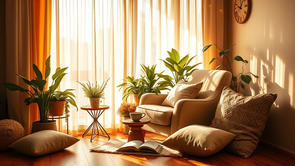
As autumn arrives, let the warm tones of autumn leaves inspire you. Incorporate earthy browns, burnt oranges, and deep golds, celebrating the season's harvest and inviting a sense of warmth. These hues can be complemented by seasonal textures like cozy throws and woven baskets, enhancing your home's inviting feel.
When winter comes, embrace the tranquility of winter whites. Crisp whites and soft grays can evoke a serene, calming environment, perfect for cozy evenings by the fire. You can likewise introduce festive shades to celebrate holiday themes, bringing in pops of festive reds and greens that spark joy and connection.
Accent Colors to Enhance
When you're looking to enhance your space, choosing bold accent colors can make a striking impact. You can likewise play with neutrals and add pops of color for a balanced yet dynamic look. Plus, adjusting your accents seasonally can keep your home feeling fresh and inviting all year round.
Choosing Bold Accents
Adding bold accent colors can transform a room, making it feel lively and inviting. When you choose striking hues, you breathe life into your space. Think about how a radiant cerulean throw pillow or a fiery orange vase can instantly uplift your décor, creating a warm and welcoming atmosphere.
Playful accent choices are key here; they allow you to express your personality and style. Consider bold color combinations that contrast beautifully with your existing palette. For instance, pairing a rich emerald green with bright coral can create an eye-catching focal point.
Don't shy away from experimenting! Layering different textures and patterns in these bold shades adds depth and intrigue. You might find that a painted accent wall in a daring navy provides the perfect backdrop for your artwork, as well as playful, colorful accessories tie the whole look together.
Neutrals With Pops
Incorporating neutrals with pops of color can improve your home's aesthetic and create a balanced yet dynamic atmosphere. By using neutral textures, you set a soothing backdrop that allows lively accents to shine. Think about your furniture choices—soft beiges or grays paired with bold cushions or throws in rich jewel tones can add depth and interest.
Color layering is key; start with a neutral base and introduce accent lighting that highlights your chosen pops. This not just brings warmth but also guides the room flow, making spaces feel cohesive yet lively.
Your home is a canvas for personal expression. Consider style diversity in your accent choices—mix cultural influences through artwork selection or decorative items that resonate with you. Seasonal themes can as well play a role; perhaps you swap out accent pieces to reflect different times of the year, keeping your space fresh and inviting.
With these strategies, you'll create a home that not only feels welcoming but also tells your unique story, making every corner a reflection of who you are.
Seasonal Color Adjustments
Adjusting your color palette seasonally can breathe new life into your home and keep it feeling fresh. As the seasons change, so do the colors that inspire us. Embracing seasonal trends can create a cozy, inviting atmosphere that reflects your mood and the world outside your window.
Start by incorporating accent colors that align with the current season. In spring, think soft pastels or lively florals; in summer, opt for bright, bold hues that evoke sunshine. Autumn invites warm earth tones, whereas winter calls for deep, rich colors that bring warmth to the cold months.
Color layering is key here. Mix and match your accent colors with neutrals to maintain balance while allowing those seasonal shades to shine. A warm throw blanket, decorative pillows, or artwork can be easily swapped out to reflect a new season without overhauling your entire space.
Experimenting with these adjustments can not only uplift your home's aesthetic but likewise improve your emotional connection to your space. Your home should feel like a sanctuary that evolves just as you do, embracing the beauty and changes of each season.
Finding Your Unique Palette
Creating a unique color palette for your home is an exciting opportunity to express your personality and style. Every hue you choose tells a story, reflecting your lifestyle and cultural influences. Start by exploring your favorite hues; they often hold the key to your personal expression. Think about the colors that make you feel alive, inspired, or at peace.
Consider current color trends, but keep in mind your palette should resonate with you. Immerse yourself in color symbolism—understanding what different shades represent can improve your mood and the atmosphere of your space. For instance, blues can evoke calmness, whereas yellows might inspire joy.
Don't shy away from historical palettes; they can serve as beautiful foundations. Look at the colors that have stood the test of time, infusing your home with a sense of continuity and depth. As you blend your favorite shades, pay attention to how they impact spatial perception. Lighter colors can make a room feel larger, while darker tones can create intimacy.
Artistic inspiration can likewise guide your choices. Whether it's a piece of art that speaks to you or a photograph from your travels, let these elements inform your palette. In the end, your color selections should be a lifestyle reflection, improving the way you feel in your space. Embrace this exploration of discovery, and soon you'll have a palette that feels uniquely yours, creating a warm and inviting sanctuary that truly resonates.
Tips for Color Coordination
Once you've settled on a unique color palette, coordinating those colors throughout your home becomes the next step. To create a space that feels cohesive and inviting, think about the color wheel basics. Start by selecting a few complementary colors that boost each other, creating visual interest without overwhelming the senses.
Use color harmony techniques to guide your choices—try a monochromatic scheme for a serene vibe or incorporate an accent color to add energy. Color mixing tips can help you blend shades effectively, giving depth to your design.
Pay attention to color trends analysis to discover what resonates with your personal style reflection. Don't hesitate to explore cultural color meanings, as they can imbue your space with significance and warmth.
Light effects exploration is essential, too; different colors change dramatically under various lighting conditions. Consider how natural light dances through your rooms and how artificial lighting can elevate or alter your chosen hues.
When it comes to color application methods, look for ways to incorporate your palette in both large and small areas—think statement walls or subtle accessories. Finally, don't underestimate the influence of mood setting colors. Choose shades that evoke the feelings you want to experience in each room, whether it's calmness in your bedroom or vibrancy in your living space. By weaving these elements together, you'll create a home that's not just stylish but truly feels like you.
Frequently Asked Questions
How Do I Choose a Color Palette for Small Spaces?
They say "less is more," and that rings especially true for small spaces. To choose a color palette, start with light colors to create an airy feel. Soft pastels or whites can make your room feel larger. Then, consider adding an accent wall with a bolder hue to add depth and personality. This balance will make your space inviting and intimate, reflecting your style as well as maximizing the coziness of your home.
Can I Use Multiple Color Palettes in One Home?
Absolutely, you can use multiple color palettes in one home! Just keep color harmony in mind to guarantee everything flows together. Different palettes can create distinct moods in each space, influencing how you feel in that room. For instance, use warm tones in your living area for coziness and cooler shades in your bedroom for tranquility. By thoughtfully combining them, you'll craft a home that resonates with your unique vibe and embraces every moment.
What Colors Work Best for Different Rooms?
When choosing colors for different rooms, consider how color psychology affects mood and room functionality. For calming spaces like bedrooms, soft blues or greens create tranquility. In lively areas like kitchens, warm yellows or oranges can energize. For cozy living rooms, rich earth tones nurture intimacy. Think about how you want to feel in each room, and let that guide your color choices. It's all about creating a space that truly resonates with you.
How Often Should I Update My Home's Color Scheme?
You should update your home's color scheme as often as it feels right for you. Seasonal updates can refresh your space and reflect your current mood or style. Think of it as a personal expression—if you're inspired by autumn's warm hues or spring's bright pastels, go for it! Regularly changing your colors keeps your home feeling lively and true to who you are. Trust your instincts, and let your space evolve with you.
Are There Colors to Avoid for Resale Value?
Did you know that homes with neutral tones sell for 5-10% more than those with bold accents? When you're considering resale value, it's wise to stick with timeless colors like soft grays or beiges. As trending shades can feel fresh, they might alienate potential buyers. Use bold accents sparingly to maintain that appealing balance. By choosing wisely, you create a warm atmosphere whilst keeping your investment secure for the future.