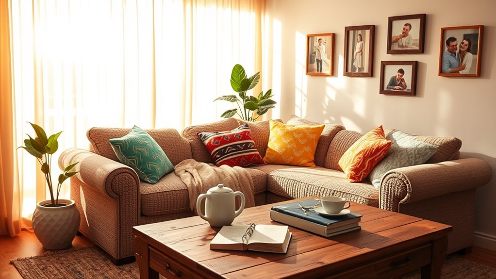

When choosing wall colors that speak to your heart, trust your instincts and let your true self guide your decisions. Your personal style, shaped by your personality, values, and experiences, should be reflected in the colors you select. Consider what evokes emotions in you, whether it's the calming effects of soft blues or the energizing vibes of lively yellows. Create a mood board to visualize your preferences and group colors by emotional responses. By doing so, you'll be able to choose colors that promote tranquility, stimulate creativity, or evoke any other desired emotional response – and that's just the starting point for creating a space that truly resonates with you.
Understanding Your Personal Style
With a blank wall staring back at you, it's easy to feel overwhelmed by the vast possibilities of colors. But before you start browsing through paint swatches, take a step back and think about your personal style. What makes you, you? What do you love, and what do you hate? Your personal aesthetics are a reflection of your personality, values, and experiences.
As you evolve as a person, your style evolves with you. Think about how your fashion sense, music taste, and even your social media feeds have changed over the years. Your personal style is a dynamic entity that's constantly adapting to your life experiences. And in regard to choosing a wall color, you want to pick one that resonates with your current style evolution.
Take some time to reflect on what you're drawn to. Do you love bold statements or soft whispers? Are you a fan of bright whites or rich jewel tones? What kind of atmosphere do you want to create in your space? By grasping your personal style, you'll be able to narrow down your color options and choose a shade that speaks to your heart. So, take a deep breath, and let your true self guide your decision. Your walls will thank you.
Exploring Color Psychology Basics
Your walls are a canvas, waiting for a splash of color that reflects your personality and style. As you initiate this creative expedition, it is crucial to comprehend the basics of color psychology. You see, colors evoke emotional responses and create personal narratives that speak to your heart. Warm tones like orange and red can stimulate energy and passion, whereas cool tones like blue and green can calm and soothe.
Cultural influences also play a significant role in shaping your color associations. For instance, whereas white symbolizes purity in Western cultures, it represents mourning in many Asian cultures. Grasping these nuances can help you choose colors that resonate with your personal story. The visual impact of color is undeniable, and light effects can dramatically alter the ambiance of a room. A soft, warm glow can create a cozy atmosphere, whereas a bright, cool tone can make a space feel more expansive.
As you investigate the realm of color, keep in mind that psychological effects are at play. Colors can influence your mood, energy levels, and even your behavior. By utilizing the influence of color, you can curate a space that not only reflects your personality but also nurtures your well-being. So, take the time to explore the realm of color meanings and associations, and let your walls become a canvas that tells your unique story.
Considering Your Lifestyle Needs
As you explore the domain of colors, your lifestyle needs become a crucial consideration. Your walls should reflect not just your personality but additionally your daily habits and routines. This is where your lifestyle preferences come into play.
When choosing a wall color, think about how you utilize your space. Do you have a large family with frequent gatherings or a quiet, solo existence? This will influence your decision on functional spaces and activity zones. For instance, a family room might require a more energetic color, whereas a home office might benefit from a calmer shade.
Here are three aspects to ponder when considering your lifestyle needs:
- Family dynamics and personal routines: If you have young children, you may want a color that can hide stains and spills. If you're a morning person, a bright, uplifting color can help start your day.
- Space utilization and design flexibility: Think about how you move through your space and how you want to use each room. A flexible design can adapt to changing needs, whereas a fixed design might limit your options.
- Maintenance considerations and daily interactions: If you have pets or allergies, you may want a color that can withstand frequent cleaning. Additionally, consider how you'll interact with the space daily – will the color stimulate or calm you?
Identifying Emotional Triggers
As you think about the emotions you want to evoke in your space, you're likely to uncover personal connections to specific colors. You might remember a happy vacation and the soothing blue of the ocean, or recall a cozy grandmother's house with its warm, golden tones. By exploring these emotional triggers, you'll start to build a visual vocabulary that will help you create a mood board and uncover the symbolism behind your color choices.
Memories and Mood Boards
One specific memory can evoke a potent emotional response, transporting you back to a particular time and place. This emotional scenery is where your personal narrative begins to unfold. By tapping into these cherished moments, you can uncover the nostalgic colors that resonate with your heart.
To create a visual representation of your emotional triggers, try building a mood board. This can be a physical board, a digital collage, or even a mental snapshot. On your board, include:
- Sensory experiences: Add images, textures, or objects that evoke a strong emotional response, such as a photo of your childhood home or a piece of fabric that reminds you of your grandmother's quilt.
- Memory hues: Incorporate colors that are tied to specific memories or emotions, like the warm beige of a sunset on your favorite vacation or the soft blue of your grandmother's eyes.
- Recollection palettes: Group colors together that evoke a specific emotional response, such as calming shades for relaxation or lively hues for energy.
Personal Symbolism Matters
Your mood board is now a treasure trove of emotional triggers, waiting to be deciphered. As you explore the images and colors that resonate with you, you'll uncover personal connections that reveal your individual expression. This is where personal symbolism matters – where color meanings transcend their literal sense and tap into your emotional resonance.
| Symbolic Hues | Cultural Significance | Personal Narratives |
|---|---|---|
| Red | Passion, energy (Western) | Represents a fiery personality or a romantic relationship |
| Green | Nature, harmony (Global) | Symbolizes growth, renewal, or a connection to the outdoors |
| Yellow | Happiness, optimism (Western) | Represents sunshine, hope, or a cheerful disposition |
As you identify the emotional triggers associated with each color, you'll begin to make heartfelt choices that reflect your personal narratives. These symbolic hues will become a part of your individual expression, weaving a fabric of meaning that's unique to you. By honoring your personal connections to color, you'll create a space that truly speaks to your heart.
The Power of Neutral Backgrounds
You're likely familiar with the overwhelming feeling that comes with a busy space. Neutral backgrounds can help calm this visual hierarchy, allowing your eyes to rest and focus on what matters. By choosing a soothing color palette, you'll create a sense of serenity that sets the tone for the entire room.
Calming Visual Hierarchy
Several interior design experts agree that a calming visual hierarchy begins with a neutral background, which sets the tone for a serene and organized space. You want to create an atmosphere where you can relax and recharge, and a harmonious visual balance is key to achieving this. By starting with a neutral base, you can then build upon it with thoughtful color layering.
Here's how you can create a calming visual hierarchy in your space:
- Establish a neutral foundation: Use a soothing neutral shade on your walls to set the tone for the room.
- Add visual interest: Introduce subtle patterns, textures, or colors through furniture, rugs, or decor to add depth and visual balance.
- Balance with accents: Use pops of color or statement pieces to create visual interest and draw the eye to specific areas of the room.
Soothing Color Palette
Neutral backgrounds play a crucial role in creating a soothing color palette, as they provide a calm and serene atmosphere that allows other design elements to take center stage. You can create a peaceful ambiance by choosing serene hues, tranquil shades, and gentle tones that exude calmness. Muted colors, such as soft grays, creamy whites, and pale blues, can help you achieve a peaceful palette. These colors create soft contrasts, allowing your eyes to move effortlessly around the space.
To create a harmonious blend, balance your shades by pairing light and dark tones. This will help you achieve easy shifts between different design elements. Subtle variations in color can add depth and visual interest to your space without overwhelming it. By incorporating neutral backgrounds, you can create a soothing color palette that promotes relaxation and tranquility. This will allow you to unwind and recharge in your personal sanctuary.
Making a Mood Board Work
Inspiration strikes when fragments of your ideal space come together in a visual representation, and that's exactly what a mood board provides – a tangible culmination of your design aspirations. This visual tool helps you distill your thoughts, feelings, and ideas into a cohesive vision, making it easier to choose a wall color that resonates with your heart.
To create a mood board that truly speaks to you, start by gathering mood board necessities like images, fabrics, and materials that evoke the desired mood and atmosphere. Then, arrange them in a way that feels intuitive and authentic to you. Don't worry too much about perfection – this is a process of discovery, not a polished presentation.
Here are three key elements to include in your mood board:
- Visual inspiration: Include images of spaces, colors, and textures that inspire you, whether from magazines, Pinterest, or real-life experiences.
- Personal touches: Add personal items like family photos, heirlooms, or sentimental objects that hold emotional significance for you.
- Color cues: Incorporate color swatches, paint chips, or fabric scraps that evoke the desired mood and atmosphere – these will help you narrow down your wall color options.
Trusting Your Instincts
With your mood board in hand, you're now ready to tap into your inner designer and trust your instincts in regards to choosing a wall color. This is where the magic happens, and you get to connect with your deepest desires. Your mood board has given you a sense of direction, now it's time to tune in to your instinctive choices.
| Emotional Resonance | Wall Color Options | Why It Works |
|---|---|---|
| Calm and Serene | Soft Blues, Mint Greens | These colors evoke feelings of relaxation and tranquility, perfect for a bedroom or meditation space. |
| Energized and Playful | Lively Yellows, Coral Reds | These colors stimulate creativity and enthusiasm, ideal for a home office or playroom. |
| Sophisticated and Elegant | Rich Charcoals, Deep Purples | These colors exude luxury and refinement, suitable for a formal living room or dining area. |
As you explore these options, pay attention to how they make you feel. Do you feel uplifted and inspired, or do you feel drained and overwhelmed? Trust your instincts to guide you in the direction of the colors that resonate with your emotional state. Remember, this is your space, and it should reflect your personality and style. By trusting your instincts, you'll create a space that not only looks beautiful but also feels like home.
Navigating Color Trends Wisely
Your personal style and preferences have led you to a few promising wall color options, but before making a final decision, it's essential to evaluate the current color trends. You want to confirm that your chosen color not only resonates with you but also complements the architectural style of your home and the cultural influences that shape your design inspiration.
When maneuvering through color trends wisely, consider the following factors:
- Seasonal shifts: Don't get caught up in a trend that's only suitable for a specific time of year. Choose a color that will remain timeless and adaptable to changing seasons.
- Color forecasting: Stay informed about upcoming color trends, but don't feel pressured to follow them blindly. Instead, use them as inspiration to find a color that genuinely speaks to your personal expression.
- Design harmony: Confirm your chosen color integrates seamlessly with the texture, light effects, and space perception of your room. This will create a sense of architectural harmony, making your space feel cohesive and inviting.
Balancing Bold and Subtle Choices
When choosing wall colors, you're likely to contemplate both bold and subtle options. To create a visually appealing space, it's crucial to strike a balance between these two extremes, and you can start by selecting a neutral background that won't compete with your furniture or decor. By doing so, you'll set the stage for bold accents to unite the room and create harmony through contrast.
Neutral Backgrounds Matter
Most interior designers agree that a well-chosen neutral background is essential to balancing bold and subtle choices in your wall color scheme. By selecting a neutral tone, you create a timeless elegance that won't compete with other design elements in the room. A neutral background likewise allows for better light reflections, making the space feel brighter and more inviting.
Here are three key benefits of using neutral tones:
- Enhances space perception: Neutral walls create a sense of continuity, making the room feel larger and more open.
- Allows for layering textures: You can add warmth and depth to the space by layering textures, such as throw blankets, rugs, and furniture, without overwhelming the senses.
- Provides visual flexibility: Neutral backgrounds are adaptable schemes that can easily accommodate changes in furniture, decor, or personal style over time, giving you the freedom to experiment and evolve your space.
Bold Accents Unite
Take your neutral background to the next level by striking a balance between bold accents and subtle choices. This harmonious blend will create a visually appealing space that speaks to your heart. By incorporating bold color combinations, you'll create striking focal points that draw the eye. Accent wall ideas, such as a lively coral pink paired with soft cream, add a playful contrast to your space.
| Bold Accent | Subtle Choice | Resulting Look |
|---|---|---|
| Deep Navy Blue | Light Gray | Dramatic, Sophisticated |
| Bright Yellow | Soft Mint Green | Cheerful, Whimsical |
| Rich Emerald Green | Creamy Beige | Adventurous, Nature-Inspired |
| Fuchsia Pink | Soft Peach | Playful, Feminine |
| Burnt Orange | Muted Sage | Warm, Inviting |
Harmony in Contrast
As you explore bold accent options, you'll find that balancing them with subtle choices is key to creating a visually stunning space. Harmony in comparison is all about finding emotional balance by combining bold statements with softer, more understated tones. This delicate dance of color pairing allows you to create a space that's both visually interesting and calming.
To achieve this harmony, consider the following:
- Contrasting tones: Pair bold, bright colors with softer, muted shades to create visual interest and balance.
- Texture interplay: Mix rough, tactile textures with smooth, matte finishes to add depth and dimension to your space.
- Seasonal influences: Consider the time of year and how it affects your mood and color preferences, incorporating seasonal hues to create a sense of continuity.
Creating a Cohesive Palette
You've collected paint swatches, fabric scraps, and inspiration images, and now it's time to distill them into a cohesive color palette. This is where color theory comes into play. You'll want to identify the underlying thread that connects your chosen colors, whether it's a specific hue, tone, or texture.
To create a harmonious palette, contemplate the 60-30-10 rule: 60% of a dominant color, 30% of a secondary color, and 10% of an accent color. This balance guarantees visual flow and prevents overwhelming the senses.
| Color Combination | Tonal Variations | Accent Walls |
|---|---|---|
| Monochromatic | Soft, muted tones | Add texture with fabric or wallpaper |
| Complementary | High-contrast colors | Create a focal point with bold color |
| Analogous | Gradual, soothing changes | Introduce subtle pattern with wallpaper |
| Triadic | Bold, lively colors | Add a pop of color with furniture or decor |
| Neutral | Calming, natural tones | Use light reflections to create depth |
When selecting colors, remember to take into account your personal preferences, the natural light in your space, and the texture play of various materials. You may as well want to make seasonal adjustments to your palette to reflect the changing moods and ambiance of each time of year. By thoughtfully curating your color palette, you'll create a space that truly speaks to your heart.
Bringing It All Together Harmoniously
Now that you've crafted a cohesive color palette, it's time to reflect on how these hues will interact with each other in your space. As you envision the final result, contemplate how each element will harmonize to create a space that truly speaks to your heart.
- Texture Variety: Think about how different textures will interact with your chosen colors. Will the roughness of a natural fiber rug clash with the smoothness of a glossy wall? Balance texture variety to create a visually appealing space.
- Light Effects: Ponder how natural and artificial light will affect your color palette. Will the warm glow of a sunset bring out the richness of your chosen hues, or will the harshness of overhead lighting make them feel flat?
- Space Perception: How will your color palette influence the perception of your space? Will a bold color make a small room feel more intimate, or will a light color make a large room feel more airy?
As you bring your color palette to life, remember to reflect on the cultural influences that have shaped your personal style, along with the seasonal changes that will affect the mood of your space. Your personal experiences, furniture integration, and artwork selection will all play a role in creating a harmonious space. Don't forget to take into account the architectural features and natural elements that will interact with your colors. By carefully balancing these factors, you'll create a space that truly reflects your heart's desire.
Frequently Asked Questions
Can I Use Wallpaper Instead of Paint for a Unique Look?
You're thinking of ditching paint for wallpaper to add some personality to your space. That's a great idea! Wallpaper can bring a level of sophistication and uniqueness that paint can't match. With textured designs and bold patterns, you can create statement walls that become the focal point of your room. Plus, it's a great way to add some tactile interest to your space. Go for it, and get ready to fall in love with your new walls!
How Do I Choose a Color That Will Hide Imperfections?
You're searching for a color that's like a gentle hug, wrapping your walls in a soothing embrace that conceals imperfections. To find this perfect shade, consider color psychology: warm neutrals like beige or taupe can create a sense of calm, whereas cool tones like blue or green can distract from flaws. Don't forget texture tricks – a subtle sheen or soft matte finish can likewise help hide imperfections. Experiment with samples, and trust your instincts to find the one that whispers "serenity" to your soul.
Can I Use the Same Color on Walls and Ceiling?
You're wondering if you can use the same color on walls and ceiling. Although it's tempting to create a seamless look, consider the ceiling height and how it affects the room's ambiance. Using the same color can make low ceilings feel claustrophobic, whereas high ceilings can handle the continuity. Think about color psychology – a single hue can create a sense of calm, but it can likewise feel overwhelming. You decide what works best for your space and mood.
Do I Need to Consider the Natural Lighting in Each Room?
You're wise to reflect on the natural lighting in each room. It's crucial to contemplate how it affects the color temperature, which in turn influences the mood you want to create. For instance, north-facing rooms receive cooler, bluer light, whereas south-facing rooms get warmer, yellower light. You'll want to choose colors that complement or contrast with these natural hues to create the ambiance you desire. By doing so, you'll guarantee your space feels cozy, inviting, and truly yours.
Can I Get a Refund if I Don't Like the Final Result?
"When in doubt, sleep on it" – and that's exactly what you'll want to do if you're unsure about the final result of your wall color project. But, what if you wake up still unhappy? Don't worry, you're protected! Check the refund policies of your contractor or supplier to guarantee they prioritize customer satisfaction. If not, you might be able to get a refund or compromise on a solution that works for you. Remember, your happiness is key, and you deserve a result that makes you smile.